There is a version of this post that walks you through a checklist. Eight things to fix on your senior living website by Monday. A list of CTAs to add, forms to shorten, page speeds to chase. Something you can hand to your web vendor and feel like progress is happening.
This is not that post.
Not because checklists are wrong. They are useful. But the actual reason most “good” senior living websites still do not convert has very little to do with anything on a checklist. It has to do with what the website was built to do in the first place, and whether that matches how families actually move through this decision.
Most senior living websites today are competent. They look modern. They load reasonably fast. They have a hero image, three care levels, a contact form, and a tour request CTA. Compared to where the industry was five years ago, the baseline is significantly better.
And yet the same conversations keep happening. Occupancy goals slip. Lead volume looks fine on paper but the quality feels off. Tours are not booking at the rate they should. And the instinct is always the same.
We need a new website.
Sometimes that is true. More often it is not. More often the website is doing exactly what it was built to do, which is look good and explain the community. The problem is that “look good and explain the community” is not the same as “guide a real person through one of the harder decisions their family will ever make.”
A lot of what is in this post came from sitting inside these systems. From watching how families actually behave on the site versus how the analytics narrative tells the story. From working through the agency-built version, the developer-built version, and the platform-template version. The pattern is the same regardless of who built it.
The Baseline Has Shifted
There was a time when having a clean, modern, mobile-responsive website was a real advantage. If your competitors had outdated sites with broken forms and stock photography, just showing up with something better was enough to move occupancy.
That moment has passed.
Now everyone has a “good” website. The industry caught up. Templates exist. Agencies that specialize in senior living have refined their processes. Builders like Elementor and Webflow have made it easier to launch something that looks professional without spending six figures.
The result is that the question changed quietly without most operators noticing.
It used to be: is our website better than the competition.
Now it is: does our website actually do anything when someone shows up.
That is a different problem and it requires a different approach.
The Agency Path and the Developer Path
There are basically two ways most operators end up with a website right now, and both have a version of the same gap.
The agency path looks like this. You hire a senior living marketing agency. They are good. They know the industry. They have done this hundreds of times. They have a template that works. They onboard you with thoughtful questions about your differentiators, your KPIs, your leadership’s priorities, and your competitive positioning.
The website launches. It costs somewhere between fifteen and forty thousand dollars depending on the scope. It is on time, on budget, and on brand. It is also one of several websites that agency launched that month.
That is not a knock on the agency. They have built a repeatable process and the process produces consistent results. But repeatability and consistency are not the same as built for your specific funnel. And in the onboarding conversation, the questions almost always center on what the community wants to say. Rarely do they center on what the person on the other side actually needs to figure out.
The developer path looks different. You skip the agency. You hire a freelance developer or a small studio. Someone who can build a beautifully designed, fast-loading, fully responsive website. They are technically excellent. The Lighthouse scores are perfect. The code is clean.
But do they understand the senior living decision cycle. Do they understand that the adult daughter searching at eleven at night is not the same person as the corporate facilities director who fills out a vendor form. Do they understand the gap between “I am interested in learning more” and “I am ready to book a tour.”
Most of the time, no. That is not a failure on their end. Their job was to build a website, not to understand how families move through a six-month decision.
The result, in both paths, is a website that is good at being a website and not necessarily good at being a conversion engine for senior living specifically.
Design Is Not Conversion
Here is where the two ideas start to collapse into each other.
A “good” website usually means it looks nice, it is easy to navigate, and it explains what the community offers. Those are real things. They matter.
But conversion is not about clarity in isolation. Conversion is about movement. What does this person do next. And more importantly, does the next step the website is asking them to take actually fit where they are in the decision.
This is where most senior living sites lose people. The default primary action is Schedule a Tour. Sometimes it is a contact form that asks for name, email, phone, preferred community, preferred care type, and a message. Both are versions of the same assumption, which is that the person showing up is ready to talk.
Most of the time they are not.
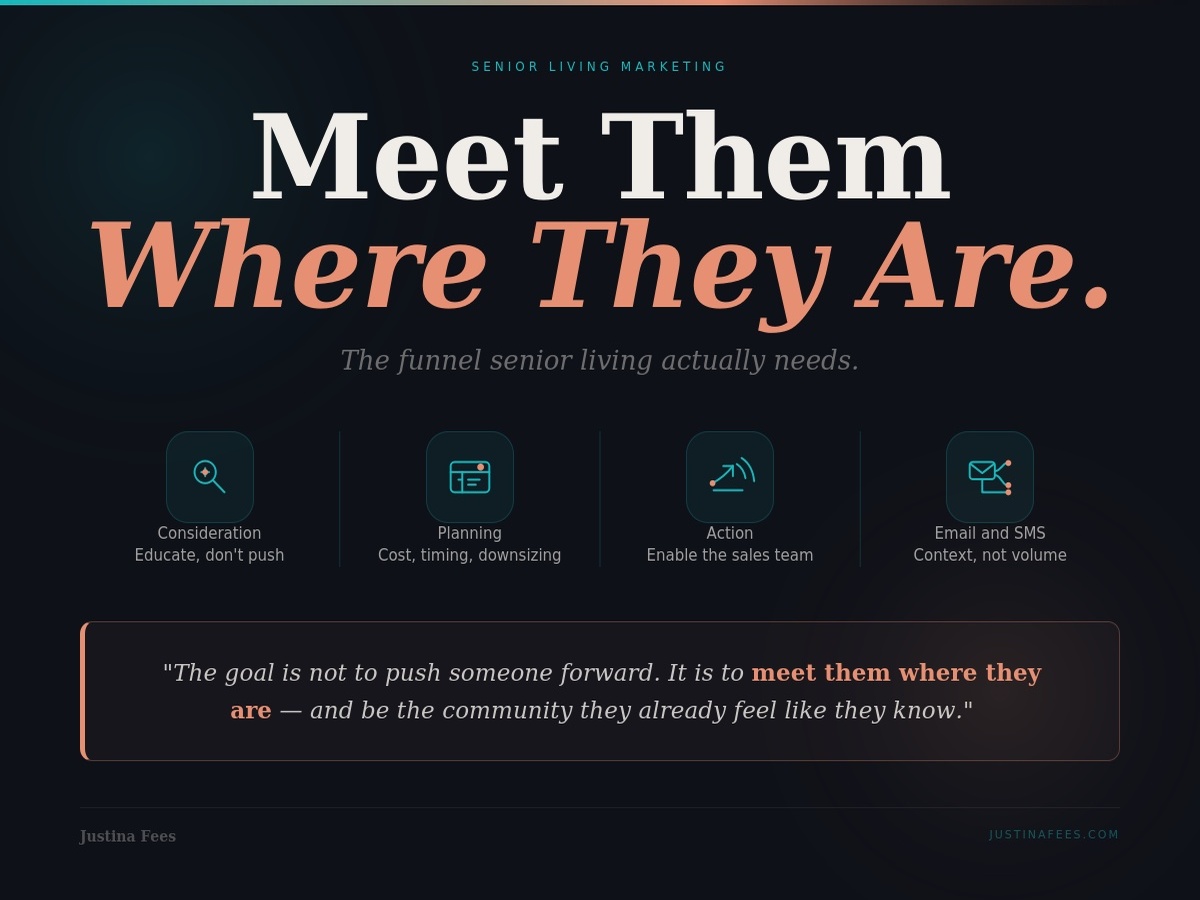
If you read The Funnel Senior Living Actually Needs, you already know the four phases families move through. Consideration. Planning. Action. Denial. Only one of those phases, action, is anywhere near tour-ready. Everyone else needs something different.
A website that only offers Schedule a Tour is converting one out of four phases. Maybe less than that, because plenty of people in the action phase are also not quite ready to commit to a calendar booking with a sales counselor they have not spoken to yet.
Conversion Points by Phase
The fix is not more buttons. The fix is the right buttons in the right places, calibrated to what someone is likely doing on each page.
Someone landing on a community overview page is probably early. They are scanning. They want to understand what kind of place this is. The right conversion point is something low-pressure. A brochure download. A virtual tour. An invitation to subscribe to a community newsletter that does not require a phone number.
Someone landing on a pricing or cost page is further along. They are asking a real question, which is can I afford this. The right conversion point is something that gives them a meaningful answer without forcing them to fill out a contact form first. A cost calculator. A pricing range page with no gate. A guide to financing options.
Someone landing on a memory care page from a specific search is probably in active research. They have a person in mind. They are trying to understand whether this community handles the care level their family needs. The right conversion point can be more direct. A chat with a counselor. A guided assessment that helps them think through care levels. A specific contact form for that care type, routed to the team member who handles it.
Someone landing on a tour or contact page is closer to action. They have already done their research. They are ready, or close to it. The right conversion point is the easy version. Click to call. Book directly through a calendar. A short form with three fields, not nine.
The website should offer different ways to convert because the people showing up are in different places. That is not complexity for the sake of complexity. That is meeting people where they are.
Why Traditional CRO Does Not Translate
Conversion rate optimization in most industries is built around a simple premise. Reduce friction. Shorten forms. Add urgency. Test headlines. Push people through the funnel faster.
That playbook does not apply cleanly here.
In senior living, the goal is not to push someone faster through the funnel. It is to create a system that can meet them where they are. Pushing a family that is not ready usually does not accelerate the decision. It pushes them away from your community and toward the next one that handles the moment with more patience.
The CRO instincts that work elsewhere can actively hurt here. An exit-intent popup feels aggressive in this context. A “only three tour slots left this week” urgency banner reads as manipulative when the person is making a long-term decision about their parent’s care. Cutting form fields down to just an email address sounds clean until you realize the sales team now has no idea what care level the person is asking about or which community they were looking at.
The frame has to shift. CRO in senior living is not about pushing. It is about offering. Offering the right next step, sized to the readiness of the person on the page, in a way that respects that this is a hard decision and nobody is going to be rushed.
That requires understanding the funnel before you touch the website. If you do not know what phase your traffic is mostly landing in, you cannot calibrate the conversion points to it. And without that calibration, every “good” website ends up looking the same. Beautiful. Functional. Underperforming.
The Website Is Part of a System
A website does not convert in isolation. It converts inside an ecosystem that includes the traffic strategy that brings people to it, the messaging that matches what those people clicked on, the CRM that catches what they submit, and the follow-up that runs when they go quiet.
If any of those pieces are misaligned, the website looks like the problem even when it is not.
The clearest example. A community runs a paid campaign targeting adult children researching memory care. The ad copy is empathetic and educational. The landing page it points to is the homepage. The homepage features beautiful imagery of independent living residents. The CTA is Schedule a Tour. That is a conversion problem, but it is not a website problem. It is a routing problem. The ad and the page do not match.
Another example. A site has a well-built brochure download. The form fires, the brochure delivers, the CRM captures the contact. But the only automation that exists after that is a generic confirmation email. Two weeks later, when the person is starting to ask real questions, nothing has happened. No follow-up touchpoint. No relevant content. They search again and end up on a competitor’s site that has been showing them helpful content the entire time. That is a follow-up problem, not a website problem. But it shows up as a website conversion problem in the reporting because the brochure download “did not turn into a tour.”
How the CRM is set up to catch and route those leads determines whether the website’s effort goes anywhere or evaporates. Until the system around the website is aligned with the website itself, conversion data lies. The site looks like it is underperforming when really the rest of the pieces are not pulling their weight.
Start With What the Site Is Already Doing
Before recommending a rebuild, the more useful starting point is an audit. Not a redesign audit. A behavior audit.
Look at where people actually are on the site. Which pages are pulling traffic. Which pages are losing them. Where the scroll depth drops off. What gets clicked and what gets ignored. Where the forms get abandoned and at which field.
Read the heatmaps. Watch the session recordings if you have them. Read the chatbot transcripts. Those tell you what people are actually asking versus what the site is structured to answer.
Look at the conversion paths. Of the people who do convert, what path did they take to get there. What pages did they touch first. What CTAs worked. Is there a pattern that suggests a stronger version of the funnel that the current site is not making easy.
Look at the gaps. Where are people clearly trying to find something they cannot. Where is the chat being used for questions the site should answer in the content. Where is the FAQ being read in volume, and what does that say about the gaps in the navigation.
Most of the time, the audit produces a list of changes that are smaller and cheaper than a rebuild. Better routing. Different CTAs. A new page that addresses a question the site keeps dancing around. Form changes that match the phase of the visitor.
Sometimes the audit does point to a rebuild. But the diagnosis comes from the data, not from the assumption that a new site is the answer.
Better Conversion Is Quieter
The conversion improvements that actually move the needle in senior living are rarely the loud ones.
It is not more popups. It is not more urgency. It is not more “schedule a tour” buttons jammed into more places on the page.
It is the right CTA for the right moment. It is a cost page that answers the question without requiring a form. It is a brochure download that goes to a parent in the consideration phase, with a follow-up sequence designed for someone who is not ready to talk yet. It is a memory care landing page that lets a family ask one specific question instead of forcing them into a generic contact form.
These are small changes. They do not look dramatic in a redesign presentation. They are also the changes that consistently produce better lead quality without increasing volume in a way that burns out the sales team.
If the Website Is Not Converting
It might not be broken.
It might just be a “good” senior living website that was built to look right, not to work right. The fix is rarely a full rebuild. The fix is figuring out what the people showing up actually need from the page they are on, and making sure the next step the site is asking them to take matches that.
That is harder than a redesign. It is also the work that actually moves occupancy.
If any of this sounds familiar, let’s talk.